Welcome to my year 12 media portfolio, the
task was to create a music magazine that would challenge or follow the conventions
of a genuine music magazine. In preparation for this task a preliminary task
was set to create a school magazine in order to get used to using various
editing formats such as Photoshop. This then lead into further research for
creating a more professional looking music magazine. My blog will show you the stages
I went through to create my magazine, followed with an audience feedback video and
evaluation. My finished product will be shown on the top posts of my blog.
Wednesday, 8 February 2012
Monday, 6 February 2012


Wednesday, 1 February 2012
Product evaluation
1. In what ways does your media product use, develop or challenge forms and conventions of real media products?
What Kind of Media Institution Might Distribute Your
4. How did you attract/address your audience?
5. Who would be the audience of your media product?
6. What have you learn about technologies from the process of conducting this product?
7. Looking back at your preliminary task, what do you feel you have learnt in the progression from it to the full product?
Preliminary task to full product by SuzieMaynard


2. How does your media product represent particular social groups?
3. What kind of media institution might distirbute your media product and why?
What Kind of Media Institution Might Distribute Your
4. How did you attract/address your audience?
5. Who would be the audience of your media product?
6. What have you learn about technologies from the process of conducting this product?
7. Looking back at your preliminary task, what do you feel you have learnt in the progression from it to the full product?
Preliminary task to full product by SuzieMaynard


Tuesday, 24 January 2012
Thursday, 8 December 2011
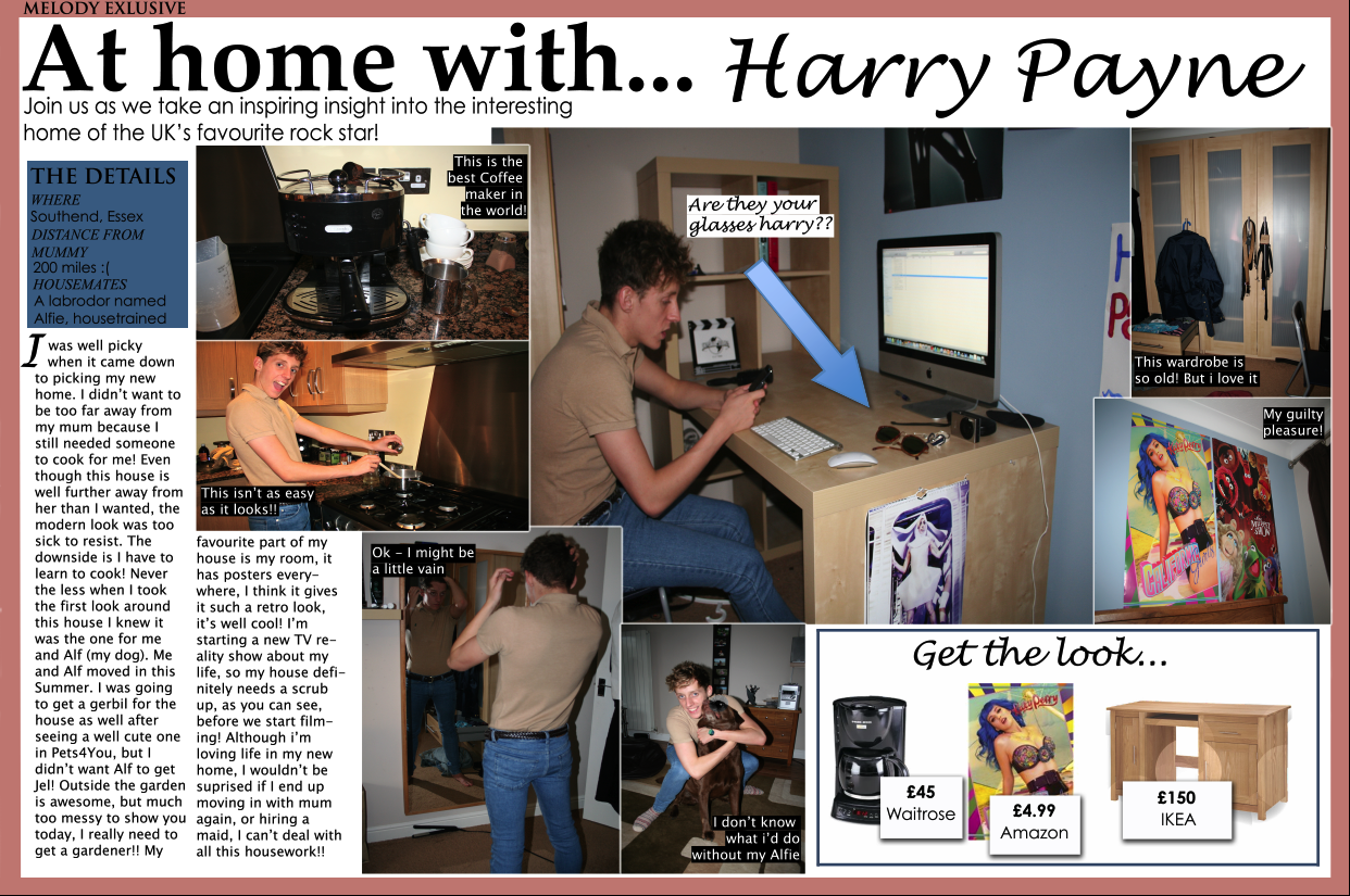
Deciding on the background of my double page spread


These are the two different backgrounds i have created for my double page spread. I felt that the colored background lightened the page up, but I also felt it was very different from the house style i created in my magazine as my contents page has a white background.
The white background, although plainer, suits the house style of my magazine and is also more suited to my target audience as it gives off a more mature look. I also felt that white suited the other colors I used on my double page spread such as blue and peach.
Subscribe to:
Comments (Atom)