Welcome to my year 12 media portfolio, the
task was to create a music magazine that would challenge or follow the conventions
of a genuine music magazine. In preparation for this task a preliminary task
was set to create a school magazine in order to get used to using various
editing formats such as Photoshop. This then lead into further research for
creating a more professional looking music magazine. My blog will show you the stages
I went through to create my magazine, followed with an audience feedback video and
evaluation. My finished product will be shown on the top posts of my blog.
Wednesday, 8 February 2012

Monday, 6 February 2012


Wednesday, 1 February 2012
Product evaluation
1. In what ways does your media product use, develop or challenge forms and conventions of real media products?
What Kind of Media Institution Might Distribute Your
4. How did you attract/address your audience?
5. Who would be the audience of your media product?
6. What have you learn about technologies from the process of conducting this product?
7. Looking back at your preliminary task, what do you feel you have learnt in the progression from it to the full product?
Preliminary task to full product by SuzieMaynard


2. How does your media product represent particular social groups?
3. What kind of media institution might distirbute your media product and why?
What Kind of Media Institution Might Distribute Your
4. How did you attract/address your audience?
5. Who would be the audience of your media product?
6. What have you learn about technologies from the process of conducting this product?
7. Looking back at your preliminary task, what do you feel you have learnt in the progression from it to the full product?
Preliminary task to full product by SuzieMaynard


Tuesday, 24 January 2012
Thursday, 8 December 2011


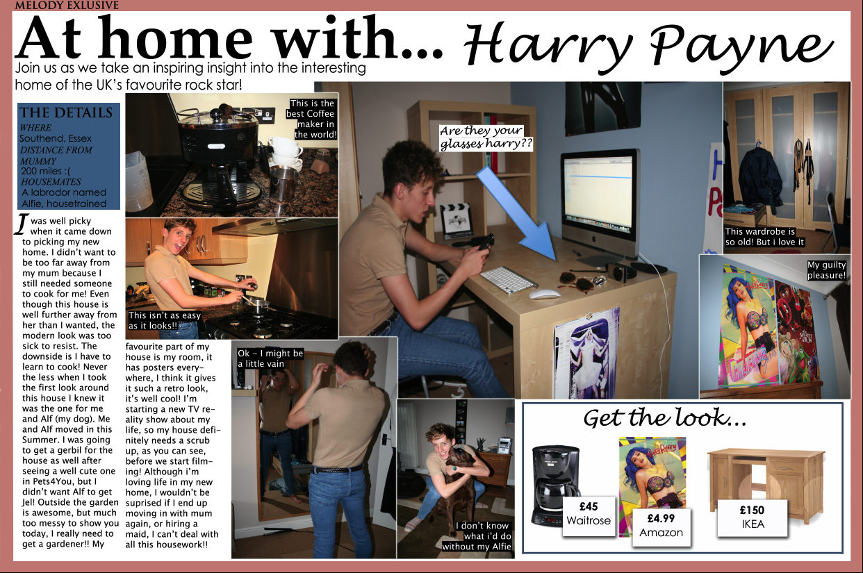
Deciding on the background of my double page spread


These are the two different backgrounds i have created for my double page spread. I felt that the colored background lightened the page up, but I also felt it was very different from the house style i created in my magazine as my contents page has a white background.
The white background, although plainer, suits the house style of my magazine and is also more suited to my target audience as it gives off a more mature look. I also felt that white suited the other colors I used on my double page spread such as blue and peach.
Wednesday, 7 December 2011

Tuesday, 29 November 2011
Analysis of my finished contents page
analysis of my contents page by SuzieMaynard


I have also chosen the masthead that was neater and used the name of my magazine, I used the same typography that I used on my front cover when creating my masthead. This was to create a house style through out the magazine.
Thursday, 24 November 2011
Deciding on my contents page


These are my two different styles of contents pages, I will ask my peers in my class which they preffer
The making of my contents page

This is my contents page half way through editing.
- I have chosen to keep it quite plain and easy to read as i felt this would be most suited to my audience.
- I have used a variety of different fonts to add style to the page
- The master head is the same font and style of my front cover as this creates a house style
- The style of the contents page is similar to the style of NME contents page, as i found from my questionnaire that this is the most popular magazine for my target audience
- The main image is centered in the middle of the contents page, the article advertised by this image is what my double page spread is based on
- I have and will add more images around the page to advertise other articles that would be suited for the audience to read
Various styles of mastheads

In this masthead I added the word Melody to add repetition of the magazines name, I also made the font of melody the same font I used in my masthead on my front cover to create a house style.

In this masthead I didn't add the word melody as I wanted to make the masthead smaller, but I felt this left out the house style that I wanted to create.

In this final masthead I separated the words so that they weren't as clamped up, I felt this made the masthead look neater.
Wednesday, 23 November 2011
What I have done today

I carried on editing my contents page into the style that I had researched (NME). I really like the style on NME contents page and intend to get mine similar.
Tuesday, 22 November 2011
Other photos I have taken

I liked this photo as it showed a fun side to my band, I edited it so that it had a modern feel to it and also so the background was less obvious and a brighter white color. I also felt that it shows off their individual personalities.

I like this photo as the band are all looking away from the camera, this makes the reader focus more on what they are wearing rather than their faces. It is a more serious photo of the band. Although the background is white there is an object in the right corner which puts me off the image as I wanted an all white background.

I like this photo as the background works really well. The artists are also all in a good position. The girls are both crouching and the boys have their foot against the wall. I edited this photo to make it look more modern, although it also had a vintage feel to it.

I like this photo as the distance between the artists are all equal and the background is clear and modern. I edited this so that the band name was introduced 'Kraze' this creates an identity for the band as a group.
I will use these photos on my contents page as images of another band
Sunday, 13 November 2011
Editing my front cover
This is the process I went through for creating and editing my masterhead
This is the process I went through for adding effects to my main attraction of the article
This is the process I went through in advertising free posters, I made the box opaque so that it didn't cover up too much of the image or look tacky.
Friday, 11 November 2011
Choosing the image for my front cover


These are the two images I want to use for my front page, but I am unsure on which one to use. I will ask people in my target audience what front cover would attract them most.
Typography

Gill Sans Ultra Bold

Lucida Calligraphy

Trajan Pro
These are my three types of typography for my music magazine, I was unsure on which one to use as I wanted to create an Indie look but still make it look like a music magazine. In the end i went for the Lucida Calligraphy as I felt it had the most indie and modern look but still kept a typical music magazine style.
Thursday, 10 November 2011
Wednesday, 9 November 2011
Editing photos

This is the original photo I took for my contents page of my magazine.

This is the edited photo, I cropped it to make it fit the contents page better for the style I had chosen. I didn't use any colour effects as I wanted to photo to look natural.


This is one of the photos I want to use for my front cover, I edited it on iPhoto to get rid of blemishes and I changed to contrast to add more color.


This is another photo I wanted to use for my front cover, I edited it on Iphoto to get rid of blemishes and also to brighten the image so there was not so much of a shadow.


Subscribe to:
Posts (Atom)